
Selective colour. Refine your palette.
Quieten a green, shift a red, deepen a blue. Refine the colours that shape the photograph without changing the whole palette at once.
Open editorPro
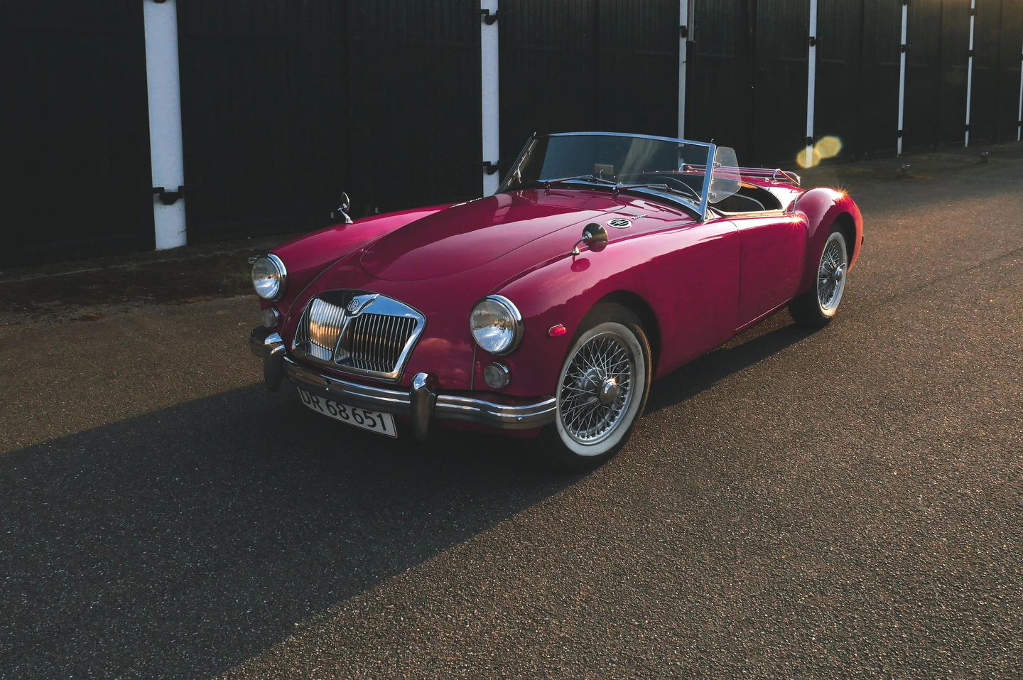
A strong palette does not need every colour to shout.
Sometimes the overall treatment feels right and one colour still takes over. Green foliage may compete with a face, a blue sky may feel too insistent, or a red object may need a slightly different relationship to the rest of the scene. Selective colour gives those decisions their own space.
Photonica provides hue, saturation and brightness controls for eight ranges: red, orange, yellow, green, aqua, blue, purple and magenta. Work on the range that matters, then look at the entire photograph again. The value of the tool is often a quieter background rather than a dramatic new colour.
The selection is based on colour, not on objects. Two red objects can change together; skin and warm surroundings can share parts of the orange or red ranges. That is why small adjustments and a whole-frame review are more useful than concentrating only on the object you intended to change.
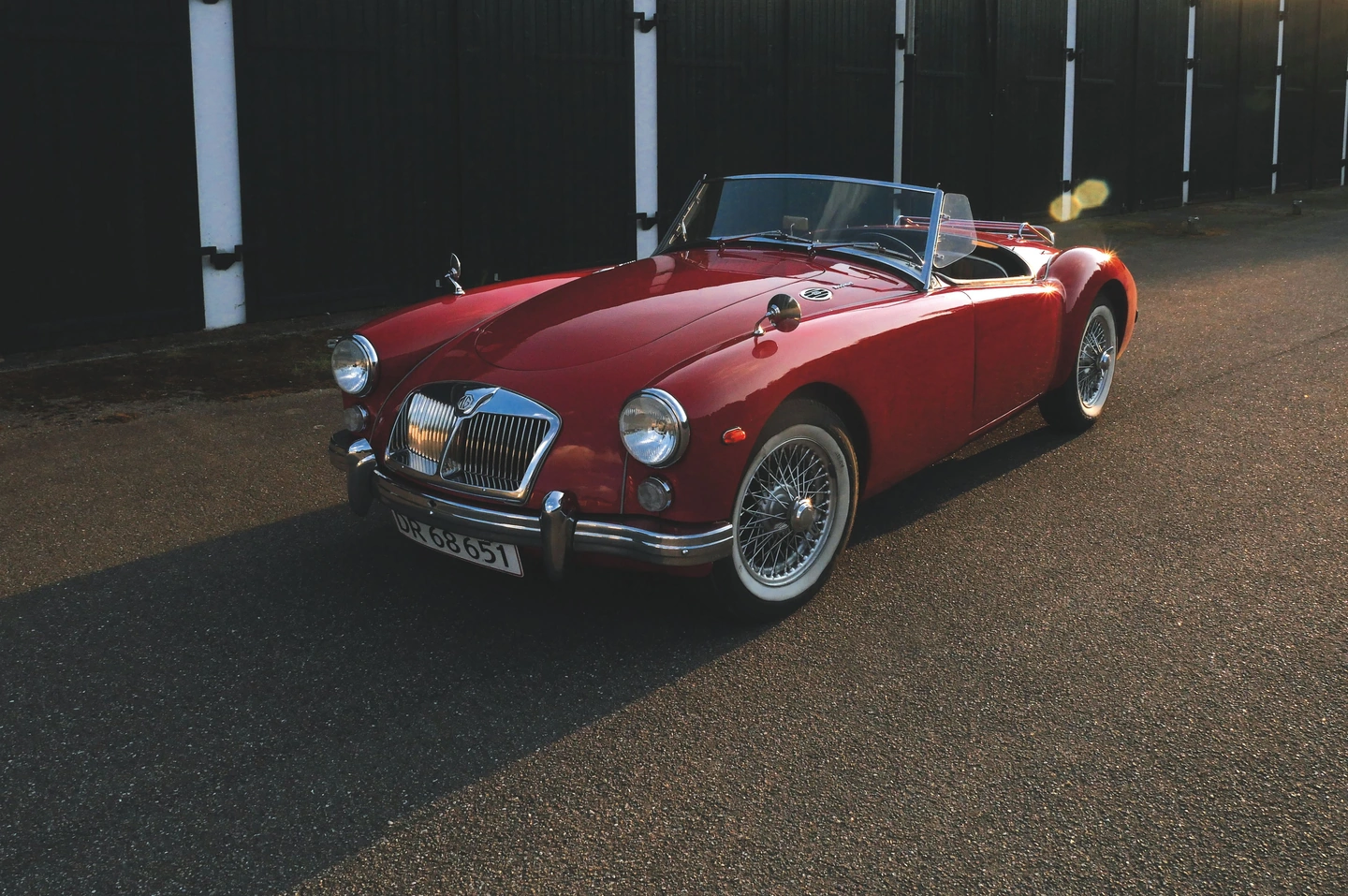
Before Photonica / red-range adjustment. The original sunlight and flare are part of the source.
Let one colour lead.
The red bodywork gives this photograph a natural focal colour. Compare the treatment while keeping an eye on the nearby warm surfaces. The purpose is to refine a relationship within the existing palette, not to claim the car has been automatically selected.
Move the divider to compare. Before on the left, after on the right. Zoom in to look closer.
Made with Photonica. Source photographs retain their photographer’s original treatment. Film and optical effects are creative interpretations.
When to use selective colour.
A starting point for your photograph. Let the subject and the light guide the final choice.
Portraits surrounded by foliage
Reduce the visual weight of greens when leaves pull attention away from a face. Check yellow-green highlights too, and avoid pushing the background so far that it feels disconnected from the original light.
A single memorable accent
Refine a coat, boat or painted door that already anchors the frame. A modest saturation or brightness change can help that colour read clearly without making the entire photograph more intense.
A more consistent blue
Explore aqua and blue when sea and sky feel out of step with a chosen film. Judge reflections and shaded clothing as well, since the same ranges can appear in less obvious places.
Find your balance.
- Colour range
- Select one of eight ranges. Move between neighbouring ranges when a colour sits near their boundary, checking that transitions remain natural.
- Hue
- Shift the direction of the selected colours. Start gently; a large shift can change several parts of the scene in ways that are easy to miss at first.
- Saturation
- Make the selected range more or less colourful. Reducing competing colours is often as effective as strengthening the main one.
- Brightness
- Change the lightness of the selected colours. Use this to refine separation, then check whether the scene still feels lit consistently.
How to use selective colour in Photonica.
Name the colour problem
Decide whether a colour is too strong, too dark or simply the wrong hue. Start with the corresponding control rather than moving all three.
Adjust one range
Make a restrained change and scan the entire image, especially skin, reflected colour and bright edges.
Compare at the final viewing size
A palette that feels subtle up close may read strongly on a small screen. Return to the whole image before deciding the adjustment is finished.
Pro Compare Free and Pro.
A few things to know.
Can I make one object colourful and everything else black and white?
You can reduce other colour ranges, but this is not an object-selection tool. Anything sharing the retained colours may remain colourful, and the result depends on the source palette.
Should I choose the film first?
Choosing a foundation first gives you a stable reference for colour refinement. You can revisit the film later, but recheck the selective adjustments after a substantial change.
Photography: Nordic Overdrive on Pexels. Edited in Photonica.
Make it your photograph.
Bring a photograph and see where it takes you. Your photo stays on your device.
Open editorUse a WebGPU-compatible browser. Free JPEG export uses a working image up to 2560 px on its longest side before cropping.
Explore all photo editing tools